No More Boring Newsletters!
- Nishi Bharti
- Jul 22, 2024
- 3 min read
Welcome to the behind-the-scenes look at the creation of the Arya Samaj Toronto Summer Camp newsletter.
During the summer of 2024, I had the honor of being part of the Arya Samaj Toronto summer camp. As a designer and camp supervisor, I was thrilled to combine my love for working with children with my passion for design. This page will take you through the thought process, design choices, and creative journey that brought this newsletter to life.

Design Philosophy
Understanding the Audience
The primary audience for our newsletter consists of busy parents with limited time. With this in mind, I aimed to create a design that was:
Quick to Read: Concise and engaging content was essential to ensure parents could quickly grasp the key highlights of the week.
Visual Appeal: Incorporating pictures of their children having fun made the newsletter more personal and enjoyable.
Visual and Functional Elements
Color Scheme: The Power of Orange
Choosing the right color palette was crucial. I selected orange for several reasons:
Significance to Arya Samaj: Orange is deeply rooted in Arya Samaj's spiritual and cultural identity, symbolizing purity and renunciation.
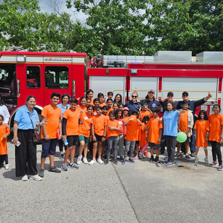
Visual Cohesion: The children’s t-shirts were also orange, creating a cohesive and harmonious look throughout the newsletter.
Emotional Impact: Orange is a warm, energetic color that conveys enthusiasm and joy, perfectly reflecting the camp's vibrant atmosphere.
Creating an Interesting Newsletter
From Boring to Engaging
Newsletters often have a reputation for being boring, but I was determined to change that. Here’s how I made our newsletter interesting:
Dynamic Layout: I used a mix of bullet points, short paragraphs, and high-quality images to create a visually engaging and easy-to-read format.
Personal Touch: Including pictures of the children and their activities added a personal and emotional element that parents loved.
Vibrant Design: The use of bright colors and playful designs made the newsletter visually appealing and fun to read.
Layout and Structure
The layout was designed to be user-friendly and visually engaging:
Bullet Points and Short Paragraphs: These formats ensure that the information is easily digestible and quick to read.
High-Quality Images: Featuring pictures of the children participating in various activities added a personal touch and helped parents connect with the content.
Balanced Design: I balanced text and images to keep the newsletter visually appealing without overwhelming the reader.
Creative Process
1. Gathering Content
Collaborating with counselors, supervisors, and volunteers, I collected testimonials, highlights of key events, and candid moments captured throughout the week.
2. Drafting the Layout
Using a grid system, I sketched the initial layout, ensuring that each section had its own space and that the flow was logical and easy to follow.
3. Incorporating Feedback
Feedback from the camp staff and a few parents helped refine the design, ensuring it met the needs and expectations of our audience.
4. Final Touches
The final version included carefully selected images, vibrant orange accents, and well-organized content that together told the story of the camp’s first week.
A Sneak Peek at All the Fun with Kids and Volunteers at Camp.
Conclusion
Designing the Arya Samaj Summer Camp newsletter was a fulfilling and enriching experience. It allowed me to merge my passion for design with my love for working with children, resulting in a creation that resonated deeply with parents and brought smiles to many faces.
Feel free to explore the newsletter and see for yourself the joy and excitement of our summer camp. Thank you for joining me on this creative journey!

The final Newsletters pages that went live.


Comments